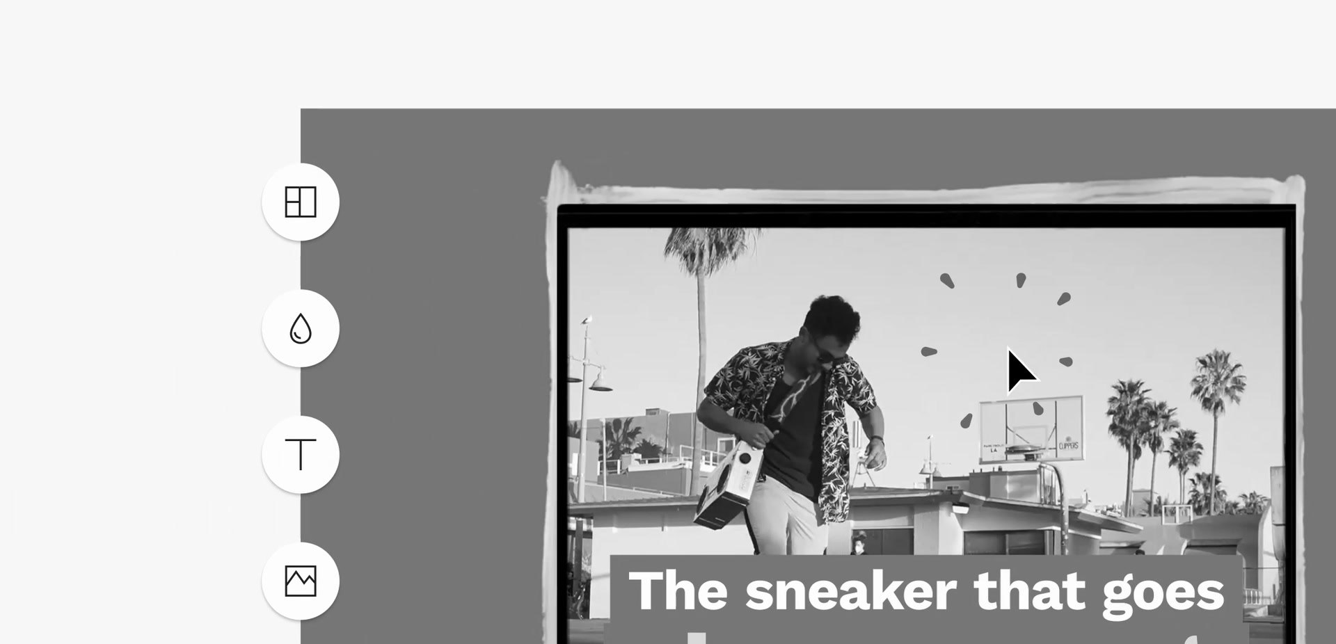
The 35-second homepage video. Featuring a promotional video built in the product.
Problem
The rebrand gave Animoto a completely new look, across both the marketing site and the product. Motion was planned as a key part of the new web design from the start, as Lottie animation and as video.
The site had to show every core feature, and make each one clear to someone who had never used Animoto. Those visitors needed to understand what the product does, and how easily, before they read a word of copy.
Approach
Website animations
I made the video and most of the animated graphics for the website.
The homepage piece is true video. The feature animations through the
rest of the site shipped as Lottie.
I designed the Lottie animations in Figma, brought them into After
Effects to animate, then exported them and added them to
LottieFiles.
Five feature animations and the 404 page, playing as Lottie.
Mini UI system
Marketing needed a version of the product that was simple and
registered at a glance, but still showed every core feature. I
designed and animated a mini UI system to solve that. It went on to
be used in ads, training videos and on the
website.
The mini tour, built with the mini UI system.
Tutorial videos
People new to Animoto needed to learn the editor quickly. Animoto's education centre is where that happens. I created a series of tutorial videos,
led by a host, published on YouTube and on the tutorials page.
The first twenty seconds of the quickstart guide, a two-minute video in the series.
Outcome
The new site launched with the video and animations in place. The mini UI system outlasted the launch. It became the standard way Animoto showed its product, in ads, training videos and across the website.