Paved is a newsletter ad network that connects marketers with publishers.
A major change in the brand called for a redesigned logo. It needed to be
simple and easy to recognize, as a full wordmark and as a
single-letter icon.
Paved's homepage also has to explain a marketplace: getting a
brand into newsletters, running campaigns across many publishers,
and seeing how they perform. Each animation had to make one of
those ideas clear in a few seconds.
Approach
The logo
I drew the wordmark in rounded lowercase, from a small set of
shared shapes. It is custom lettering, drawn for Paved rather than
set in an existing typeface. The icon is the first letter on its
own.
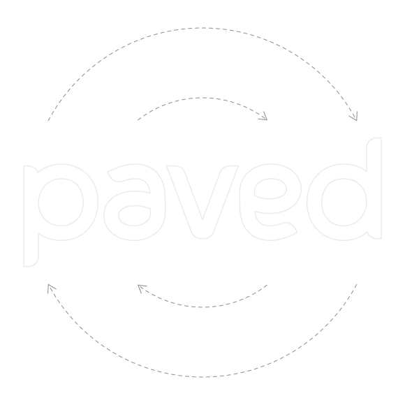
The "pa" and the "ed" are made from the exact same shapes, so the
logo is almost an ambigram. It reads the same right side up as it
does when it is flipped. Only the "v" has to stay upright. It is
a useful trick for brand animation.
Turned half a circle, the wordmark still reads as paved, apart from the v.
Variants
The wordmark in mint and in white, and the icon in two colourways.
Homepage animations
The design of the homepage was primarily Jorge's work. I did
the animation and built the Lottie files that run on it.
The three homepage animations, playing here as Lottie, as they do on the site.
Paved MCP launch video
For the rollout of the Paved MCP, an AI connector for newsletter
advertising, I made the launch video. It follows a marketer inside
an AI assistant as they find newsletters, compare them, book
placements and pull a report, without leaving the chat.
The video for the rollout of the Paved MCP.
Outcome
It is Paved's logo today, in use on paved.com. The animations
are live on the Paved homepage, and the video launched the Paved
MCP.