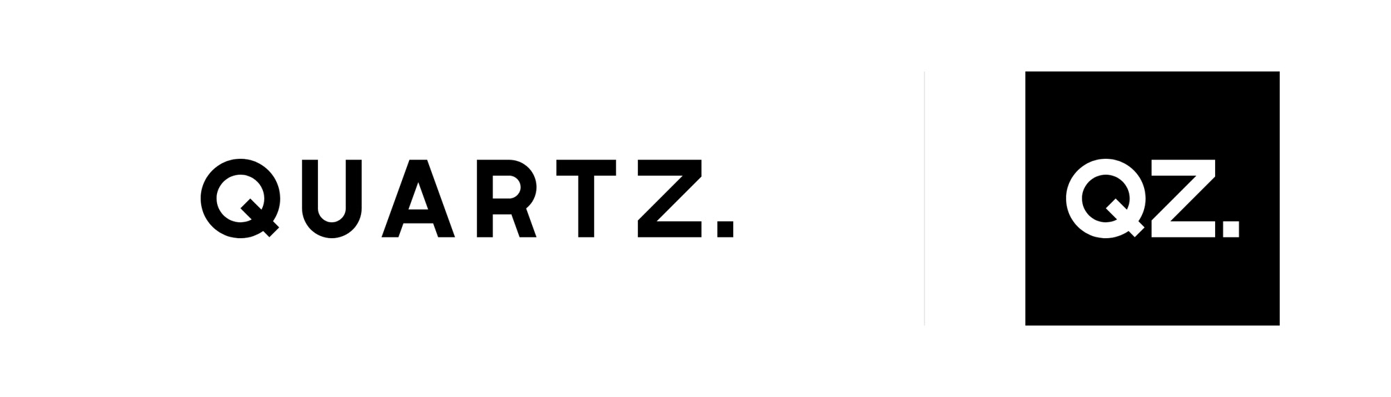
The wordmark on dark and on light, and the QZ icon.
Problem
Quartz had already built a huge amount of brand equity, and
the new logo had to preserve it. A two-letter .com domain alone is an incredibly valuable asset. The job was to refresh the mark
and bring it in line with a space that is highly competitive
today, without losing what its massive audience already recognized.
The analysis ahead of the redesign turned up a key finding.
Quartz has two audiences. Core Quartz readers come for premium
content and deep engagement. Mass Quartz readers arrive through
social and search, and move fast. One logo had to serve both
without splitting the brand in two.
Approach
This direction builds on the strongest equity the Quartz brand
already had, a familiar, legible, typography-first wordmark.
Rather than introduce a radically new form, I refined and extended
what already worked, putting continuity, clarity and scalability
first.
The wordmark is custom lettering, drawn for Quartz rather than
using an existing typeface. It's bold and readable at speed and at any size, so
it works equally well as a masthead, an app header, a social
avatar, and a video or newsletter identifier. Its simplicity lets
the content lead.
The period
The period adds a small but deliberate sense of finality. It is
a visual full stop that presents Quartz as a definitive voice, and
it is also a flexible piece of punctuation that can be reused
across the system. It's not a decoration. It's a structural
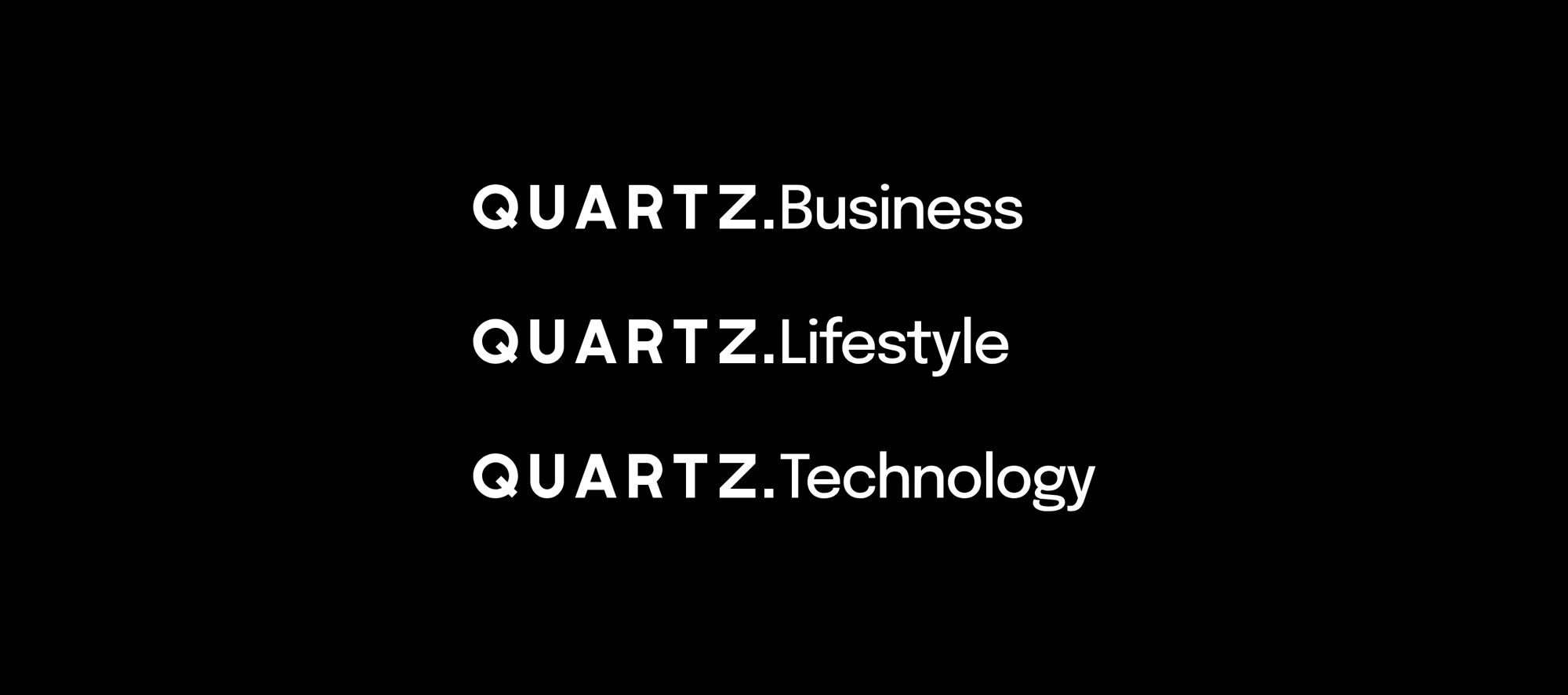
element that joins the name to categories and sections, as a
prefix or a suffix, and lets the identity resolve cleanly in
compact layouts.
The period joins the wordmark to a category name.
The prefix animation: Read, Share and Trust rotate in front of the name.
QZ, the short form
The QZ shorthand stays in the system for tight or
repeat-exposure contexts such as social and navigation. The
relationship between the full wordmark and the short icon is
designed to be clear, predictable and easy to animate between, so
the logo can move across screen sizes and formats seamlessly.
The logo transition between the wordmark and QZ.
One logo, two audiences
The same mark works for both. For Core Quartz it feels
established, calm and trustworthy, right for premium content,
sponsorships and deep engagement. For Mass Quartz it is fast,
legible and efficient, suited to social, search and other
fast-paced environments.
Overall, the direction favours timeless clarity over novelty,
familiarity over reinvention, and system flexibility over single-purpose design.
Outcome
The stakeholders approved the direction, and it's the logo on qz.com today. It did what the brief asked. Quartz looks sharper, bolder, and more current, and readers still recognize it immediately. The system works across the brand.