Mike Munroe

Shift

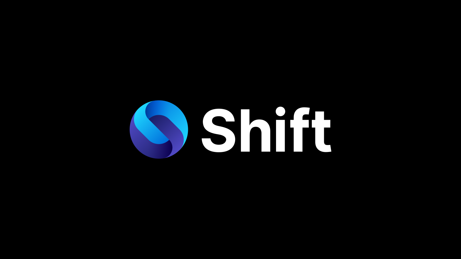
The Shift logo

Role Designer
Format Symbol, wordmark and logo animation
The Shift logo animation: a dot grows into the symbol, which turns into place, and the wordmark slides out from behind it
The logo animation, rebuilt here as an SVG animation after the one that closes the Shift rebrand video.

Problem

Shift is a browser built around spaces, which are partitioned environments that each hold their own email accounts, apps, tabs, bookmarks and more. One space might be for work, another for personal life, another for planning a trip. It is entirely up to the user. Shift adapts to how they use the internet, not the other way around.

This was a rebrand of Shift. The new logo had to look great in every context, from an app launcher icon on Windows or Mac to a social avatar.

It also had to sit confidently beside its competitors, the giants of the space, like Chrome, Safari, Edge and Firefox. A browser's icon lives in the dock or taskbar right next to them, so it gets compared with them every day.
Approach

Construction

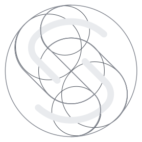
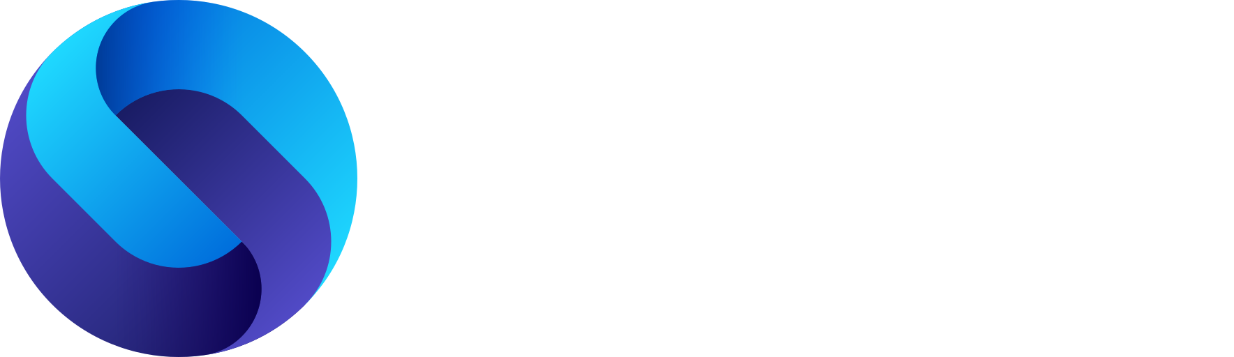
The symbol is two halves of a letter S, interwoven. The inspiration was security, fusion, connection and multiple worlds coming together. The wordmark beside it is custom lettering, drawn for Shift rather than set in an existing typeface.

Construction drawing of the Shift symbol: two interlocking S halves inside a circle, built on guide circles
The construction of the symbol.

Variants

Horizontal, stacked and symbol-only, in colour and monochrome.

There is also a flat version of the symbol, with no gradients. It is a fallback for places where a vector logo is ideal but gradients are not possible.

The flat symbol.

Outcome

The logo was accepted and has been in use for years. Its pixel-perfect app icon sits in docks and taskbars around the world, beside Chrome, Safari, Edge and Firefox, on the website, and across all of Shift's marketing. Its horizontal, stacked and symbol-only versions cover every size and context. The animation that brings the symbol and wordmark together runs through the brand's video work, including the Shift rebrand video. It stands for a product with a base of loyal users who trust Shift to organize every part of their life online.